What do Investors need?
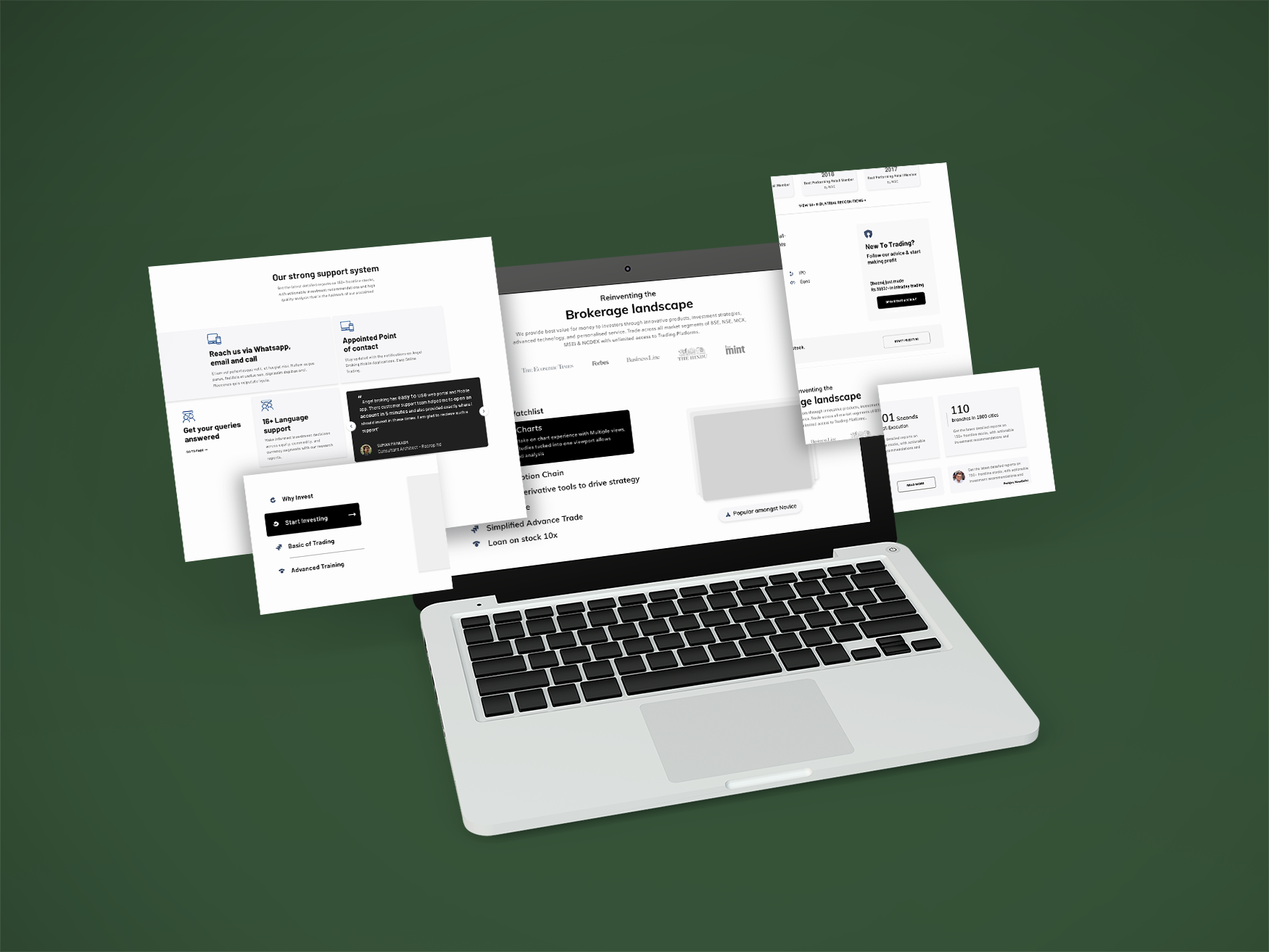
Landing Page Design
Tools:
Sketch, Miro Board, Whimsical
Responsibilities:
In a team of 4, I had the responsibility of conducting competitor evaluation, preparing documents for user pain points at the different parts of their journey, and creating the mid to high fidelity wireframes.
Brief:
Re-Design/Re-vamp Angel Broking Landing page to increase the conversion rate.
Problem Statement:
The information architecture on the existing homepage looks quite outdated and does not prominently bring out the products and services that this platform has to offer. This results in a reduction of conversion rate as well as retention rate on this website.
Context:
Client (Pseud. Besty broking) is a giant player in the trading sector in India. With 30+ years of experience, it has a world-class set of fintech products for the traders and sub-brokers. Because of the tough competition from other platforms, it was essential to enhance the user experience and introduce product success KPIs into the landing page.
User Painpoints:


Competitor Evaluation:
An in-depth competitor evaluation was conducted to understand the business tools & UX strategies used by local & global campetitors on mobile & web format.

Competitors
Robinhood | Zerodha | Webull


Design Direction:
Through user and market research and after understanding the needs of investors, collaboratively as a team, we identified different areas of the landing page that needed UX uplift to address the needs of novice, intermediate, and veteran investors.
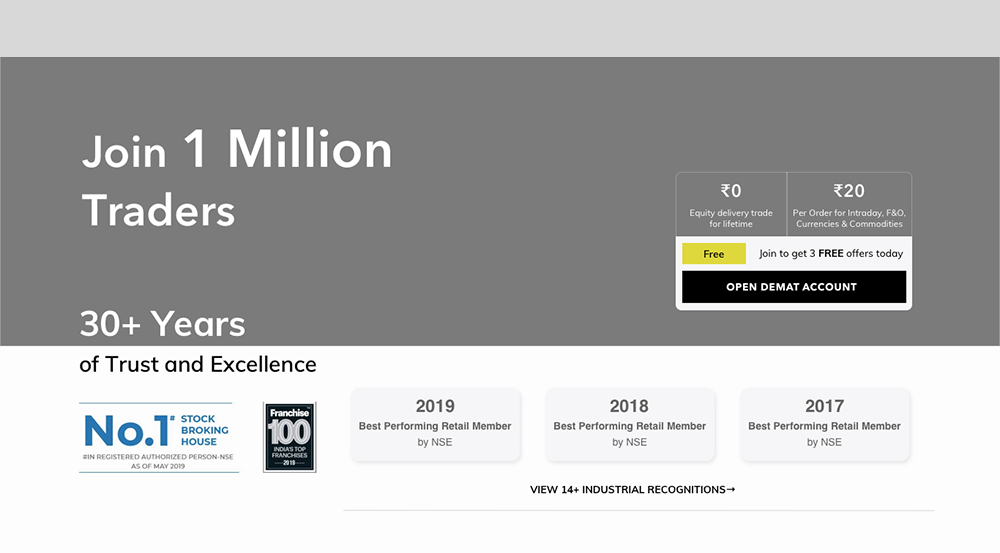
1st Viewport:
Build Credibility, Trust & Nudge the User
It is crucial to build credibility and trust in the first viewport. It does that by emphasizing on the achievements of the product, years of experience, and existing user base. It also nudges the user to open a demat account to grab free offers.
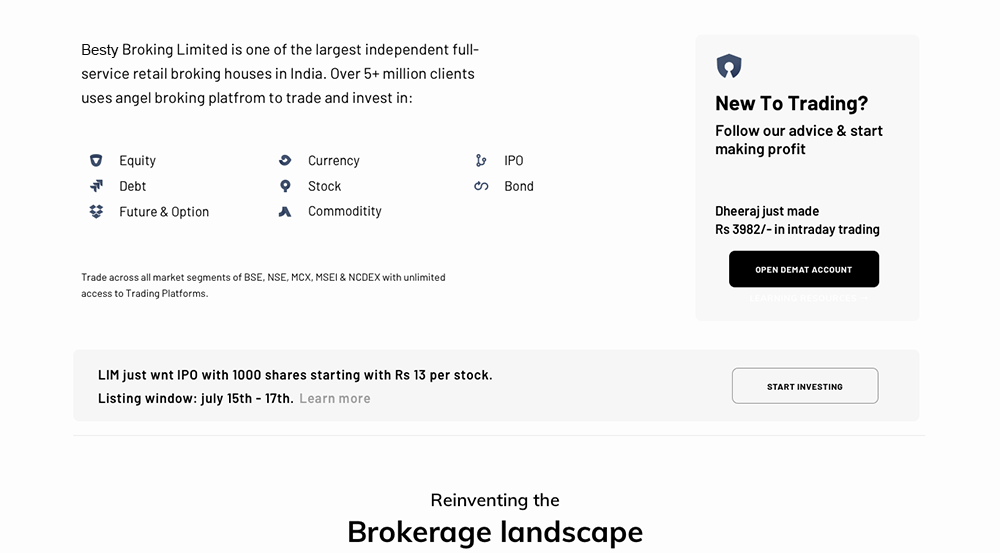
2nd Viewport:
Investment Products
The following section addresses veterans and newbies by showing different investment products that are available and testimony of an existing profit making customer. It also provides announcements of recent IPO.
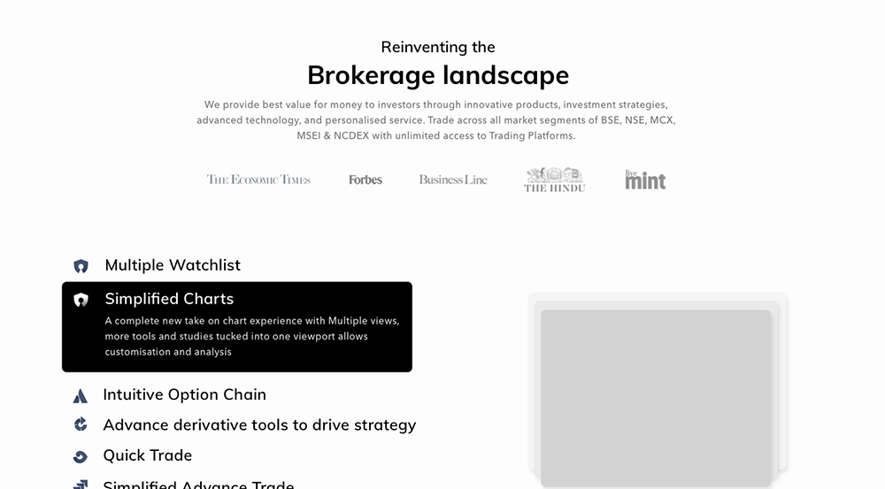
3rd Viewport:
Innovation in Sector
Once the user establishes the trustworthy image of the company, they scroll down to discover how the company is bringing new technological upgrades for the trading platforms by hovering over the listing.
4th Viewport:
Technical Capabilities
For veterans and sub-brokers, it is crucial to have confidence in the technical aspect of the trading platforms and how it will handle a large number of transactions every day. The design showcases those aspects and also provides a testimony to increase credibility.
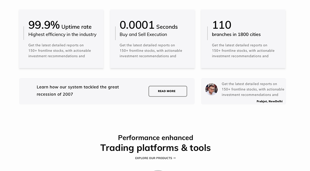
5th Viewport:
Platfroms & Tools
The further scroll shows the three products of the company accessible with a click. It provides specific download links for each product.

6th Viewport:
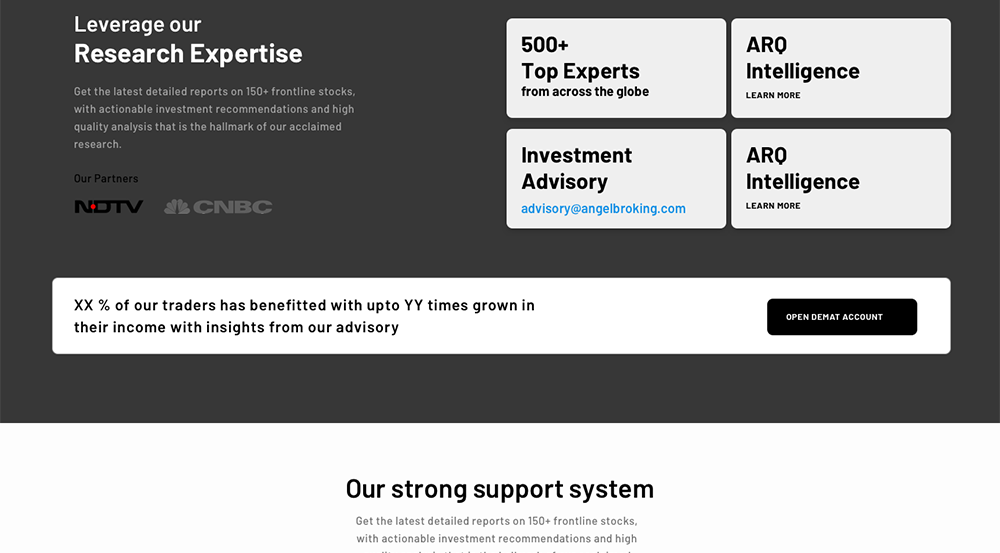
Research Expertise
The above platforms are complimented by boosting the world-class AI-based research advisory based technology of the company. It nudges both the intermediatory and millennials newbies investors to start trading without having too much knowledge of the trading landscape.
7th Viewport:
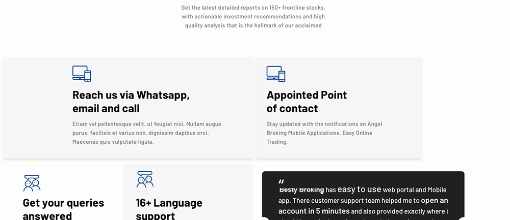
Support to Traders
The user is further reassured with the support team of the company where they can read about the existing customer and feels assured to reach out whenever they feel stuck.
8th Viewport:
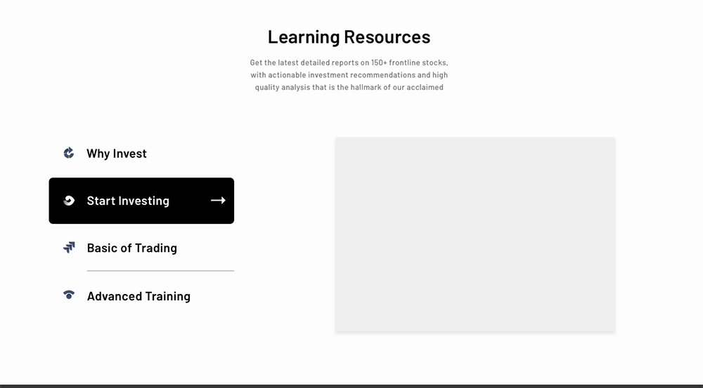
Learning Resources
Lastly, the free learning modules are available for anyone who wishes to learn more about trading.
9th Viewport:
Join the community
The final nudge for the user to open an account and enjoy benefits.

END
•••